 http://yalepress.yale.edu/yupbooks/images/full13/9780300115956.jpg
For example, he says if fifty people were asked to imagine the color red, every one of those people would imagine a different shade of red based on past experience. If people were asked to identify the red used for the Coca-Cola sign, most likely no one would get the same result as another person. We simply cannot remember exactly what hue or shade of red the Coca-Cola sign is.

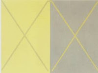
Albers also explains that our optically senses deceive us. He does numerous tests and exercises to show this. For example, he demonstrates that when the same color is place in the middle of two different colors it appears to be different. This illusion is because of the surrounding colors. Colors appear to be different when placed next to different colors.

Therefore, the designer must be careful when creating a color scheme for a design. Each viewer will have a different perception of the color so choosing color is important.


 The Nelson Art Gallery, located in UC Davis, currently is displaying many African American sewn quilts. Each quilt has its own unique pattern and design. Although all the quilts are different they all share two elements of design, pattern and rhythm.


